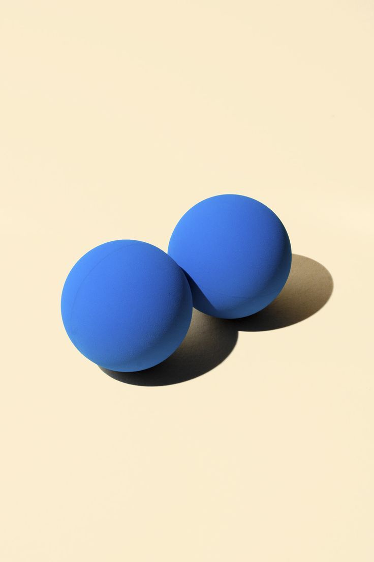
Negative space, in art, is the space around and between the subject(s) of an image.
Negative space may be most evident when the space around a subject, not the subject itself, forms an interesting or artistically relevant shape, and such space occasionally is used to artistic effect as the “real” subject of an image.
The use of negative space is a key element of artistic composition. The Japanese word “ma” is sometimes used for this concept, for example in garden design.
In a two-tone, black-and-white image, a subject is normally depicted in black and the space around it is left blank (white), thereby forming a silhouette of the subject. Reversing the tones so that the space around the subject is printed black and the subject itself is left blank, however, causes the negative space to be apparent as it forms shapes around the subject. This is called figure-ground reversal.
In graphic design of printed or displayed materials, where effective communication is the objective, the use of negative space may be crucial. Not only within the typography, but in its placement in relation to the whole. It is the basis of why upper and lower case typography always is more legible than the use of all capital letters. Negative space varies around lower case letters, allowing the human eye to distinguish each word rapidly as one distinctive item, rather than having to parse out what the words are in a string of letters that all present the same overall profile as in all caps. The same judicious use of negative space drives the effectiveness of the entire design. Because of the long history of the use of black ink on white paper, “white space” is the term often used in graphics to identify the same separation.
Elements of an image that distract from the intended subject, or in the case of photography, objects in the same focal plane, are not considered negative space. Negative space may be used to depict a subject in a chosen medium by showing everything around the subject, but not the subject itself. Use of negative space will produce a silhouette of the subject. Most often, negative space is used as a neutral or contrasting background to draw attention to the main subject, which then is referred to as the positive space.

